I absolutely love the JustRite products. The monogram is from one of their DYI kits Times New Roman font with Damask borders. This set has three different borders and 90 pt. font all in capitals. The letters fit in the center of the borders so you don't have to worry about not getting the letters centered. They do have other sets that allow for three initials and you can make the most beautiful gifts with their products. I am expecting an order any day now that has a new font set and circular block that will allow me to create my own sentiments to go around the outside with an image in the center. You may just see some cards with "Merry Christmas from the Chaltry's"
I made 10 of these thank you cards for boss's day a few weeks ago. They looked beautiful in a cellophane bag tied with black satin ribbon. I used the Swiss dot Cuttlebug folder, scallop circle Nestabilities and SU modern label and word window punches. I wanted the design to be simple yet elegant and I love how they turned out.
Elliot is staying at school for Halloween and even though it is just my husband and I, we still decorate the house. This is his favorite holiday and he loves to go all out. He carved the pumpkins last night and I took care of washing the seeds and baking them. It is a nice holiday treat when they come out of the oven all salty and warm. I still have a lot to do to get ready for the little ghosts and goblins that will be showing up soon. We hand out mini individual bags of microwave popcorn that comes in Halloween designed bags. That way if we have leftovers I don't feel so bad eating the popcorn instead of candy bars. We get cases that contain 40- bags from Sam's Club and the kids seem to like them. I'm sure their parents appreciate it just as much.
I spent the morning taking pictures of the birds that came to the crab apple trees just off our deck. I got some great pictures of a male and female cardinal that I will share with you in another post.
Take care and enjoy!
~Kim
Saturday, October 31, 2009
Saturday, October 24, 2009
Pretty and Organized
Here is a picture of how I store what I call my "pretty things". Since I ran out of storage space in the walk in closet, I had to turn to storing things on shelves. If it is going to be out in the open and I have to look at it I wanted it to be appealing. The ribbon jars are not new. I just moved some of them onto this wall. The tin pails on the upper shelf are what hold all of my alphabet chip board letters. I do have one more small shelf that is being painted and will go under the canister shelf. I have eight small candy jars just like the ones I store my ribbon in, but they will hold all my buttons by color. Below are some close-up pictures.
This is what I have been doing the last few weeks. I think I mentioned that my neighbor who is a drug representative had given me some canisters that he can no longer supply to physician offices. I covered them with ds paper- My Mind's Eye- Out & About Blue Paisley and used MS scallop doily border punch, EK Success Fleur de Lis border punch and nestabilities labels four. As you can see by the labels I store all of my chip board shapes in them. I separated them by glittered and shapes. I printed the words on the computer and then used the nestabilites which made it very easy to center them. I chose not to layer the smaller canister labels with the SU-Baja Breeze card stock for two reasons. One I would have had to layer it on a white layer so it would show up against the printed paper and two, it then became so large that it covered up most of the ds paper and up into the border. The lids are clear acrylic with just the silver metal handle. I just love how they turned out.
Her are the tin pails that I store the chipboard letters in. I had gotten them from Target awhile back in the dollar section. Like everyone else, I love that section and always find some great things to alter or use. I found some light teal clear plastic plates in the end of summer clearance isle at Walmart and although you cant see them, I painted little wooden knobs white and glued them on top in the center of the plate. I wanted something that could keep the dust out, yet was easily accessible. I divided the alphabet up into six sections because that is how many pails I had and the number that would fit on the size of shelf I had. One set of white alphabet stickers did the job, teal rhinestones and a few foam glitter butterfly stickers added some bling. The ribbon was also added for some color. This shelf is very high up and I can just reach the bottom of the pail with my fingertips. That's not saying much since I am only 5'3''. The next picture shows a close-up.
This next picture is of the section to the left of my storage shelves. The cherry cabinet is the one that impressed Elliot so much and stores all my jars and containers of flowers. I stacked some of my Sizzix dies that I use the most on top. The boxes aren't full but one of them holds my Sizzix embossing plates and Sizzlets. You can see my old Sizzix on the table below which I very seldom use any more now that I have a Big Shot. The boxed frames to the left were hand-me-downs. They were worth their weight in gold to me as they can hold quite a bit in such a small area. They fit perfectly behind the door as you come into the room and look- the bottom one is still empty. I'll have to remedy that.
I hope you get some organization tips from my post today. I know how much I enjoy a peak into other stampers rooms. I don't know if I dare show you the other side of the room. It is very well organized and every thing has it's place, but when I looked at the pictures it looks very overwhelming and busy. Maybe I'll post them at a later date.
Have fun and enjoy!
~Kim
Saturday, October 17, 2009
A bit of halloween...
This one is for you Pam!
I was working on these tags at one of our stamp clubs and I was asked what I was going to do with them. I told them that I was going to use them on the front of my Halloween cards. That was a few weeks ago and last night at another stamp club that I belong to with Pam, she asked when I was going to be posting the cards I had made with the tags. So in her anticipation I have decided to post them today. I hope you like them Pam.
I tried to keep the color pallet the same since the tags were all very similar. It also makes for a very nice photo shoot. I decided to set up my shoot with some props that adds a bit more color than just the blank white canvas. All but two of the snickers made it back into the bag. Not bad I say! I made my own canvas out of foam board and paper. You don't see the edge anymore where the back meets the bottom. I got the idea from Gina K Designs Stamp TV. She has an online magazine called Stamping lifestyle.
I think the "spooky" card is my favorite. It was a last minute decision to add the black pearls in the O's to look like eyes and I used the Martha Stewart- Drippy Doo boarder punch. The "Boo" card I used the spiderweb cuttlebug folder and then rubbed my Ranger "black soot" distressed ink pad over the top to make it pop. The letters were cut from my Sizzix script alphabet set. All of the tags were distressed with Ranger vintage photo distressed ink. I don't remember where I got the glitter foam sticker bats from- maybe Walmart. I have them all cut apart and stored in an embellishment container. There were three sizes on one sheet and I would say about 12 -15 of them per package.
Now everyone can run out and buy themselves a snicker bar or two (if they are the snack size) you deserve it. Don't forget to pick up a stamp or embellishment while you are out. I would hate to see anyone waste a trip to the store with out adding to our other addiction- hoarding. You know how it is. We may not use it- but we just have to have it.
My good friend Carol is back in Florida and she said it is so hot that they haven't been able to do much outside. For all us poor northerners, isn't it nice to know at least someone is warm. I expected to see snow flurries when I got up this morning but was happily pleased to see that the weatherman was wrong again. I'm sure it's not far off. Looks like a good day to just spend in my studio.
***Oh by the way, how do you like the NEW LOOK of my blog. I have been playing around editing the HTLM template. I was able to change the colors and the font of Dragonfly Dreams. I couldn't hold my breathe any longer waiting for Elliot. There is a designer that I have contacted that can custom design the look so it is a little fancier. You may see even a bigger change in the next month or so.
Have fun and enjoy!
~Kim
paper: SU- black, dusty durango, marigold morning (old color)
stamps: Inkadinkado-scary night, Sizzic clear stamps- happy halloween by Brenda Pinnick
ink: Ranger distressed- black soot & vintage photo, SU black
punches: Martha Stewart drippy doo boarder, SU- modern label & ticket punch, Sizzix- script
alphabet set, EK Success swirl fourish
tools: Spellbinders- label four nestabilities, Cuttlebug folders- spiderweb, skulls
Saturday, October 10, 2009
Through the window, what do I see
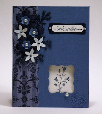
I wanted to share with you today the card I made with my Sizzix Movers and Shapers. Not so sure I would spend the money on this product. I got it very cheap so I thought I would give it a try. I have the curly label punch from SU and I think I could make the same card with just that. Unless you want the window in the center of the card any punch around the edge would give you the same result. I did like the perforated line about the label that the Movers and Shapers creates. The window that gets punched out is slightly larger than the curly label punch so it makes a nice layer. Save those scraps.
For my sentiment I used the Word Window punch and the SU "short and sweet" stamp set. I layered it with the new punch from SU called Modern Label. I then added a small pearl at each end. The card stock that I used was SU Ballet Blue and Night of Navy for the accents. The navy flowers were just some satin flowers that I put a center in using the SU Trio Flower punch and a small pearl. The white flowers were punched from an old SU punch called Spring Flower Bouquet but you could easily use any small flower punch. Because the stark white flowers were so prominent I brushed a bit of blue chalk on them to tone them down. I tucked the sprig branches punched from a Martha Stewart punch in among the flowers for more texture. Although I want to show you the detail of the flowers in the closeup, the sticky glue of the embellishments tends to really get enhanced also. Oh well- in life we have to remember to take the bad with the good. The image that I stamped on the inside of the card that shows through the window is from the SU "pocket silhouettes" set.
I am still organizing in my studio. Once I got started I couldn't stop. Elliot was home for a dentist appointment and came into my studio while I was creating. He commented how much he liked the new look. He was really liking the cabinet I put on the wall that holds all of my flower embellishments. He thought it was very cool that you could just see some color through the frosted ribbed glass door. He told me that on his drive from school he was wondering how I manage to come up with so many ideas for cards. See, he does still think of me even when he is away at school. I guess he still loves his old mom. When I hugged him he seemed even taller and of course he said I seemed even shorter. He looked good for being on his own for six weeks. A lot of PB & J he said. I don't know what I was expecting. I guess every mom wants to know that their children still need them but to see he can make it on his own (not financially yet of course) is very gratifying. I guess we did a good job in raising him.
Have fun and enjoy!
~Kim
Saturday, October 3, 2009
Simple but Elegant
It was a rainy dreary day here today. The sun had been trying it's hardest to warm up the afternoon but the clouds continued to roll in. There were a few times that the rain was pouring down in the sunshine. It actually looked beautiful as the raindrops hit the sunlit leaves. Looks like t will be the same all over again tomorrow. Now if we could have a little thunder with that, I would be all set. There is a full moon shining right now and not more than 5 minutes ago there was a downpour. Our weather certainly has been changing.
Today's card is all about the nesties. I used my new Classic Frame and Labels Four from Spellbinders. I call it simple but elegant. The designer paper is from My Mind's Eye- Laundry Line. I just love this embossed glitter paper. Again this card was going in the mail so I had to keep the embellishments to a minimum. The card stock is from Stampin' Up of course which I use 95% of the time for my cards. I love the weight and the selection of colors. I have all the inks to match and the two compliment each other for a beautiful end result.
I am still doing a bit of organizing in my stamping room. I am looking for DVD brackets that can be mounted to hold my Stampin' Up ink pads. They are strips that hold 16 each. I saw a picture on someones blog and she said she got them a few years ago at IKEA. I have sent them an email but haven't heard anything back yet. I am also waiting for a rolling storage cart with six shallow drawers to go on sale at Staples. I want to keep my scraps according to color in separate drawers and since it will only hold scraps, I don't want to spend a lot of $$ on it. I had all the scraps in a basket on my desk but I wanted to make room for some type of rotating ink storage. If I can't find the brackets to make my own, I may have to go with the one from Stampin' Up with the extender. The problem is you can't add more than one extender and I need it to hold a few more pads. We will have to see what I come up with.
Have fun and enjoy!
~Kim
Subscribe to:
Posts (Atom)